







.webp)
.svg)
The Anatomy of a High-Converting Google Ads Landing Page
The ad is never actually where the sale happens. A great headline and a compelling offer can earn the click, but the moment that really decides whether someone converts is what happens next—on the page they land on. That's the piece most businesses under-invest in, and it's exactly why so much strong Google Ads management still ends in disappointing results.
Here's what actually separates a landing page that converts from one that quietly burns the budget behind it.
Why the Landing Page Matters as Much as the Ad Itself
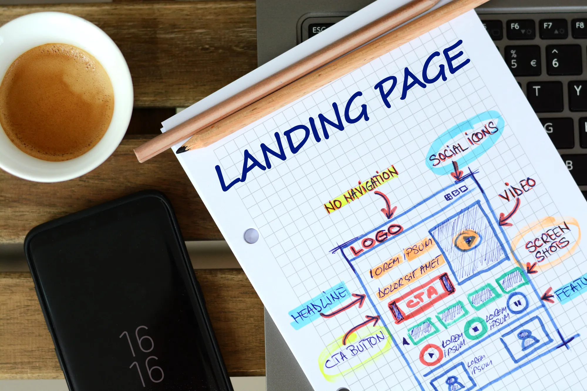
Before breaking down what a great landing page looks like, it's worth understanding why Google treats it as such a critical part of the equation in the first place. Not just for user experience, but for the mechanics of the auction itself.
The Quality Score Connection
Google doesn't just judge your ad in isolation. It evaluates the entire experience, including what happens after the click. Landing page experience is one of three components that make up Quality Score, alongside expected click-through rate and ad relevance. A weak landing page can drag down an otherwise strong campaign before it ever gets a fair shot.
Where Wasted Ad Spend Actually Comes From
Most conversations about wasted spend focus on targeting and keywords, but a page that fails to deliver on the ad's promise wastes every click it receives, regardless of how well-targeted that click was. The money was already spent the moment someone clicked; what happens next determines whether that spend produced anything.
The Cost of a Disconnected Funnel
When there's a gap between what the ad promises and what the landing page delivers, visitors don't stick around to figure out the disconnect—they leave. That gap shows up as a lower Quality Score, a higher cost per click, and a lower conversion rate, all compounding within the same campaign.
What "High-Converting" Really Means
A landing page doesn't need to be flashy to convert well; it needs to remove friction and confusion at every step. The median conversion rate across landing pages sits around 6.6%, based on an analysis of over 57 million conversions. This means the gap between an average page and a great one is often just a handful of deliberate design decisions, not a total rebuild.
Messaging Match — The First Thing Visitors Notice
Once the technical stakes are clear, the next question is simpler: what does a visitor actually see and feel in the first few seconds after landing? That experience starts with whether the message they were promised is the message they find.
Matching Ad Copy to Headline
If someone clicks an ad promising "20% Off Emergency AC Repair" and lands on a generic homepage headline about general HVAC services, that mismatch registers instantly, even if the offer is technically still available somewhere on the site. The headline should echo the exact promise that earned the click.
Keeping the Value Proposition Above the Fold
Visitors shouldn't have to scroll to understand what's being offered or why it matters to them. The value proposition, a supporting line of context, and the primary call to action should all be visible without any scrolling, on both desktop and mobile.
Tone Consistency from Click to Conversion
A playful, casual ad that leads to a stiff, corporate landing page creates a subtle but real sense of disconnect. Matching tone, not just message, keeps the experience feeling like one continuous thought rather than two disconnected pieces stitched together.
Avoiding the Generic Homepage Redirect
Sending paid traffic to a general homepage instead of a dedicated landing page is one of the most common (and most costly) shortcuts in Google Ads management. Homepages are built to serve every visitor's needs at once, which means they serve no single visitor's specific intent particularly well.
Layout Hierarchy That Guides the Eye
Messaging determines what visitors read—layout determines whether they read it at all. The way information is arranged on the page shapes attention just as much as the words themselves.
The F-Pattern and Z-Pattern in Practice
Eye-tracking research consistently shows that people scan pages in predictable patterns rather than reading every word. Structuring content along an F-pattern for text-heavy pages or a Z-pattern for simpler, visual-first pages puts key information exactly where attention naturally lands.
One Goal, One CTA
Landing pages built around a single call to action convert at meaningfully higher rates than pages offering visitors multiple competing paths forward. Every additional link, button, or navigation option is a chance for a visitor to leave before converting.
Using Whitespace to Reduce Cognitive Load
A crowded page forces visitors to work harder to figure out what matters. Generous spacing around headlines, images, and the CTA button isn't wasted space. It's what makes the important elements easy to find and act on.
Supporting Content Without Distracting From the Goal
Testimonials, feature lists, and FAQs all have a place on a landing page. However, they should support the primary conversion goal rather than compete with it. Placing this content below the fold, after the core offer and CTA, keeps the hierarchy intact.

Mobile Layout Considerations
Everything covered so far matters even more once mobile enters the picture, since most paid search traffic today lands on a phone screen rather than a desktop monitor and phones forgive far less friction.
Thumb-Friendly CTA Placement
With most paid search traffic arriving on mobile devices, CTA buttons need to sit within easy thumb reach rather than requiring an awkward stretch across the screen. Sticky CTAs that stay visible while scrolling tend to outperform ones that disappear after the first fold.
Load Speed as a Conversion Factor
Speed isn't a technical afterthought. It's a direct driver of whether visitors ever see the offer at all. Research analyzing mobile landing pages found that as load time increases, the probability of a visitor bouncing rises sharply, even within the first few seconds. A page that looks great but loads slowly rarely gets the chance to prove it.
Simplifying Forms for Small Screens
Long forms are hard enough to complete on desktop; on mobile, every additional field is an additional reason to abandon the page entirely. Asking only for what's truly necessary at this stage (and saving deeper qualification for a follow-up) keeps friction low when it matters most.
Click-to-Call as a Primary Mobile Action
For service-based businesses, a phone call is often a stronger, faster path to conversion than a form. A prominent, tappable phone number paired with live chat as a backup contact option meets mobile visitors with the fastest path to a real conversation.
Trust Signals That Close the Gap
Even a fast, well-organized, perfectly matched page can stall out at the final moment if the visitor still isn't sure they can trust the business behind it. That's where the last layer of conversion comes in.
Reviews, Ratings, and Testimonials
By the time someone reaches a landing page, they're evaluating whether to trust an unfamiliar business with their money or contact information. Visible reviews and star ratings, ideally pulled from an active reputation management strategy, answer that hesitation before it turns into a bounce.
Certifications, Guarantees, and Security Badges
Industry certifications, service guarantees, and security badges near the CTA reduce the perceived risk of taking action. This matters even more for local service businesses, where trust often has to be established from scratch within seconds of landing.
Real Photos Over Stock Imagery
Generic stock photography signals a page built to look convincing rather than to represent something real. Actual photos of the team, the physical location, or completed work carry far more credibility, even when the production quality is less polished.
Transparent Pricing or Process Information
Vague promises create hesitation, while clear, upfront information about pricing ranges or what happens after someone converts reduces the anxiety of taking that next step. Even a general framework (steps involved, typical timelines, etc.) goes a long way toward building confidence.
The Sum of Its Parts
A high-converting landing page isn't the result of one clever headline or one well-placed trust badge — it's the sum of dozens of small decisions that either build momentum toward a conversion or quietly work against it. The businesses that get the most out of their ad spend treat the landing page as seriously as the campaign structure feeding it traffic, not as an afterthought bolted on at the end.
The good news is that none of this requires starting from scratch. Most underperforming landing pages only need a handful of targeted fixes (tightening the messaging match, cleaning up the layout, or closing a mobile-specific gap, for example) to see a meaningful shift in results. Small, deliberate changes compound quickly when the foundation is already close to right.
Building High-Converting Landing Pages into Your Google Ads Management Strategy
None of these elements work in isolation. Messaging match earns initial trust, layout hierarchy guides attention, mobile optimization removes friction, and trust signals close the final gap between interest and action. Skipping any one of them creates a weak link that undermines the others, no matter how well the rest of the page is built.
This is exactly why landing page strategy deserves the same ongoing attention as keyword bids and ad copy within any serious Google Ads management approach. A page built once and never revisited will keep leaking conversions long after the campaign around it has been optimized.
If your ad spend has been climbing without a proportional increase in results, the landing page is often exactly where to look first. Get in touch with our team to see how a stronger landing page strategy could change your numbers.
Recommended for You

Meta Restricts Placement Exclusions: What Advertisers Should Do Now
Meta is limiting placement exclusions in Ads Manager. See what changed and how a Facebook Ads agency helps you adapt your ad strategy.

Google Ads Drops Language Targeting: What It Means for PPC for Small Businesses
Google Ads is dropping language targeting in September 2026. See what it means for PPC for small businesses running local search campaigns.
What Amazon's Creator Ad Shift Means for Your PPC Strategy
A PPC agency breaks down Amazon's quiet rollout of creator ad placements and what it means for your Sponsored Products budget.

Google Folds Display Into Demand Gen: What It Means for Lead Generation Ads
Google is folding Display into Demand Gen. See what changes for lead generation ads, plus how similar-audience targeting returns to display prospecting.

Make every move a power play.
Stay informed with the latest marketing insights and winning strategies.