






.webp)
.svg)
What Instagram's New Logo Teaches Us About Rebranding
Remember 2016, when Instagram ditched its old skeuomorphic camera icon for the flat, gradient-swirled logo everyone now takes for granted — and the internet acted like the world was ending? That redesign got torn apart just as hard as this one, with longtime users calling it a downgrade and mourning the "classic" look. A decade later, that once-hated icon is the version people are nostalgic for.
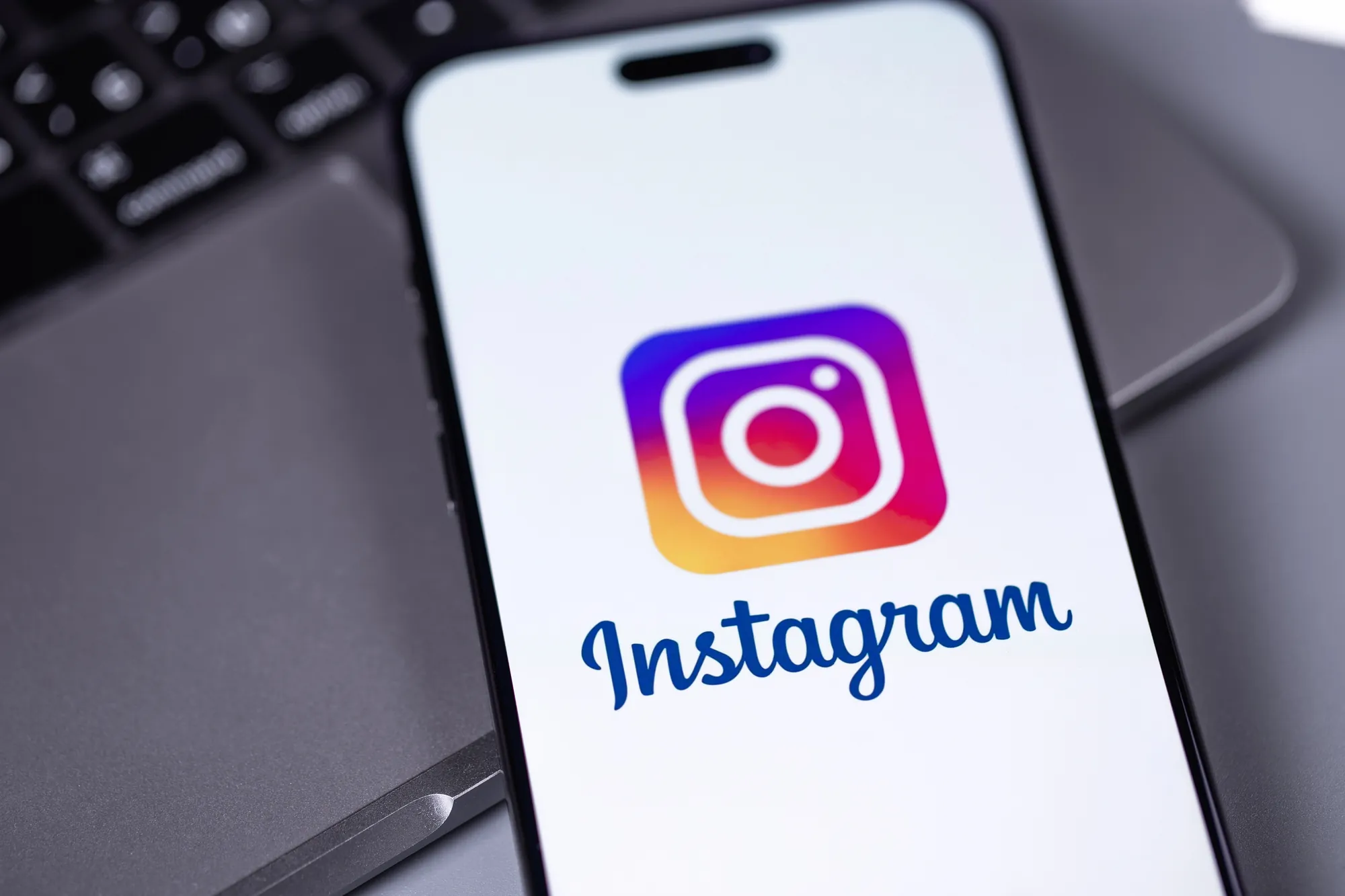
Well, it happened again. On August 13, Instagram rolled out a new wordmark, and within hours the app earned a new nickname: "Instagzam." The cursive script made the "r" look enough like a "z" that jokes about "Instagwam" and "Instaguam" started flooding replies before most users had even opened the app — exactly the kind of reaction that should give any business pause before signing off on website redesign services of their own.
Instagram's Reasoning for the Change
Instagram head Adam Mosseri explained the change simply: the wordmark had gone untouched for more than a decade and had started to feel dated. That's a familiar sentence — it's the exact reasoning a lot of business owners use right before they approve a redesign.
However, the backlash Instagram is still absorbing weeks later, and the eerily similar backlash from 2016 is a useful, low-stakes case study for anyone weighing a brand refresh, a new logo, or a full website redesign of their own. Backlash isn't automatically proof that a redesign failed. Sometimes it's just proof that people were paying attention.
What Actually Happened to Instagram's Logo
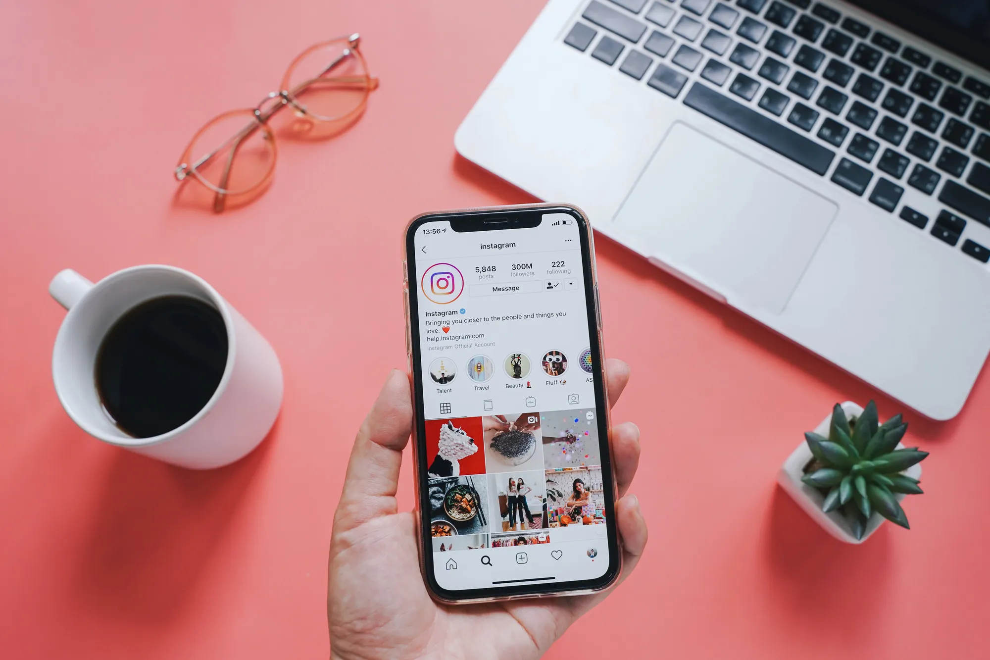
The update wasn't just a new icon. Instagram rolled out a full "brand system" refresh — new fonts, new iconography, and a redrawn script wordmark meant to feel, in the words of design director Jasmine Probst, "simpler and bolder" while keeping the handmade, spontaneous feel the brand built its identity on. The team behind the refresh has pointed to a single shape language as the thread meant to hold the whole identity together, even as everything around it got more restrained.
That's a reasonable design brief. The problem wasn't the intent — it was execution meeting real-world conditions. At the size most people actually see a logo (a tiny app icon, a profile photo, a notification badge), the new script's "r" reads ambiguously, and that one detail became the entire public conversation. A decade of brand equity was reduced in the first 24 hours to a joke about how to pronounce a typo.
This Isn't Instagram's First Rebrand Rodeo
That's worth sitting with before writing off any new rebrand as a mistake. The last time Instagram made a big visual change, the internet reacted almost exactly the same way, and the design that caused the outrage became the beloved standard within a few years. Public reaction on day one and long-term success are two different measurements, and businesses that conflate them tend to either panic and reverse a good decision or ignore real problems because they assume the noise will pass on its own.
Why "Ugly" Isn't Always the Right Word
It's tempting to read comment-section mockery as a verdict on quality. It usually isn't. Nielsen Norman Group's usability research has long documented that people tend to prefer familiar designs simply because they already know where everything is and how to use them. That reaction isn't necessarily a sign the new version is worse — it's often just a sign that it's new. Complaints after a redesign are nearly guaranteed, regardless of how good the new design actually is.
That doesn't mean criticism should be ignored — the "Instagzam" issue is a legitimate legibility problem, not just resistance to change. But it does mean business owners shouldn't panic at the first wave of negative comments after updating a logo or launching new web design services.
Some friction is the cost of changing anything people interact with daily. The real question is whether the friction fades as people adjust, or whether it points to something that genuinely doesn't work.
5 Rebranding Lessons Hiding in the Instagzam Fiasco
Lesson 1: "It's Been a Decade" Isn't a Design Strategy
Mosseri's justification — the mark hadn't changed in ten years — is true, but age alone isn't a reason to redesign something. A logo or website that's old but still working shouldn't be changed just to look "fresh." The better question is whether the current design is actually failing at its job: Is it hurting recognition? Is it hard to use on the devices and screen sizes people actually use today? Is it holding back a business goal?
If the answer is genuinely yes, a redesign is worth pursuing — and there's a real difference between a full overhaul and a lighter brand refresh that keeps what's working. That distinction is worth sitting with before committing to either one. Instagram chose the bigger swing. A local business with a logo that's simply dated, rather than dysfunctional, might get more value from a smaller evolution than a total rebuild.
Lesson 2: Legibility Isn't Optional, Even When You're Being Bold
The single detail that turned Instagram's rollout into a meme was a readability issue, not a taste issue. Design guidance on wordmark logos is consistent on this point: a logo has to stay legible at small sizes, whether that's a mobile app icon, a favicon, or a shirt embroidery — because a stylistic choice that breaks legibility at real-world scale undermines the entire design, no matter how intentional it looked in a presentation deck.
This is exactly why testing matters before launch, not after. A new logo or graphic design direction should get stress-tested at the sizes people will actually encounter it — a tiny circular profile photo, a browser tab, a single-color print — before it goes live everywhere at once. Instagram's team clearly tested for brand feel. It's less clear that they stress-tested for a five-year-old squinting at a phone screen.
Lesson 3: How You Launch It Matters as Much as What You Launch
Communication research on rebrands points to a common failure pattern: companies that change how they look without clearly explaining what has changed and why tend to confuse loyal customers rather than win them over. A redesign that appears without context reads as arbitrary, even when there's a thoughtful strategy behind it.
Not every high-profile rebrand stumbles into this trap. Pageant and entertainment brands that have leaned into more transparent rollouts tend to get more grace from their audience, because the "why" arrives at the same time as the "what." Instagram did publish an explanation alongside the launch. Still, it landed after screenshots were already circulating and the jokes were already forming — a reminder that timing the story to the reveal matters as much as having a story at all.
Lesson 4: Your Response to the Backlash Is Part of the Redesign
This is the part most businesses get wrong, and it's where Instagram, to its credit, handled things reasonably well. Rather than going silent or getting defensive, the design team gave interviews explaining the thinking behind the choices and directly addressed the "Instagzam" criticism instead of pretending it didn't exist. That tone — calm, explanatory, not dismissive — did more to settle the story down than the original announcement did.
Plenty of businesses freeze up the moment feedback turns negative, and that instinct usually makes things worse. Pest control, home services, and franchise brands constantly run into it whenever customer feedback turns harsh. A logo backlash is really a small-scale reputation management event. It responds to the same principles: acknowledge what people are saying, explain your reasoning without sounding condescending, and don't let silence do the talking for you.
Lesson 5: Budget for the Adjustment Period, Not Just Launch Day
Most businesses put all their planning into the moment a redesign goes live and none into the weeks right after. That's backwards. The first two or three weeks after any visible change are when confusion, complaints, and "did something break?" messages peak — not because the redesign failed, but because people are still relearning something they used to do on autopilot.
Instagram had a built-in advantage here: a design team and executives ready to give interviews and respond publicly the same week the criticism started. Most small businesses don't have that bandwidth on standby, which is exactly why it needs to be planned for in advance rather than improvised in the moment.
Before any logo, site, or brand update goes live, it's worth deciding who's answering customer questions about it, what the holding statement says if someone asks, "why did you change this," and how long the team will wait before deciding whether the backlash is normal adjustment or a real problem. Treating the weeks after launch as part of the project — not the finish line — is often what separates a rebrand that sticks from one that gets quietly walked back.

Getting Website Redesign Services Right the First Time
None of this means Instagram's new logo will age badly, and it doesn't mean every rebrand that gets mocked on day one is secretly brilliant either. What it does show is that a redesign lives or dies on details most people never think to check: whether the change solves a real problem, whether it's actually legible at the size people will see it, whether the story behind it reaches people before the screenshots do, and whether the team behind it can hold steady through the noise.
That's the same checklist worth running before any business touches its own logo, brand system, or site. A rebrand done well should feel inevitable in hindsight, not like a surprise nobody asked for. If a redesign has been sitting on the to-do list for a while, get in touch — we'll help ensure the update strengthens the brand rather than becoming its own headline.
Recommended for You

How to Build a Steady Review Pipeline Under Google's Stricter 2026 Rules
Google now bans staff review quotas and employee-name prompts. Learn how review generation services build a steady, compliant review pipeline in 2026.

The Real Cost of Ignoring Your Online Reputation (And How a Reputation Management Company Helps)
Ignoring negative reviews can quietly drain revenue and rankings. See what it really costs — and how a reputation management company helps.

Top Multimedia Services Every West Palm Beach Business Should Invest In
Not sure which multimedia West Palm Beach services are worth the investment? Here's what actually moves the needle for local businesses in 2026 and beyond.

Do You Need a Reputation Management Company? 8 Signs It's Time to Get Help
Negative reviews piling up? Leads slowing down? Discover the eight warning signs your business needs a reputation management company — and what to do about it.

Make every move a power play.
Stay informed with the latest marketing insights and winning strategies.